Great photography can tell a story a LOT better than a piece of written work. According to a study republished by Forbes, 91% of consumers now prefer interactive and visual content over traditional, text-based media. Visual media has been proven to perform better on all social media platforms and is one of the easiest ways to increase engagement, clicks, and replies with your posts. A picture is worth 1,000 words – as long as you are using the right ones!
Creative composition makes a great difference when trying to transform your everyday photograph into something easier on the eye. Here are 3 techniques that the Genies use to make our photos stand out from the rest:
Leading Lines
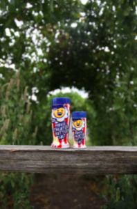
One easy trick is to look for leading lines. This creative tactic really draws your attention in and guides your eyes along the paths of a photo to help you focus on what’s really important. This effect has a similar purpose as an arrow in a graphic pointing to the emotional center of the picture.
This technique is especially powerful when it comes to landscape photography. In my experience, I have made the most out of paths, roads, and boardwalks with this technique. I notice that my eyes are being drawn down the scene, and so will the viewers. Leading the eye to the subject creates some of the best photos.


Background
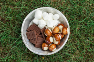
Once you have decided the subject of your photo, it is important to also consider what is behind it. The background of your photo can add more detail, but can also sometimes be too distracting. A clean, crisp background can come in handy when you would like your viewer to be focused solely on the main subject of the photo.
We use this composition technique with a lot of our food product clients. Soft, monochromatic backgrounds allow the photographer to focus solely on the subject, in this case, the delicious snacks. Changing the camera settings to blur the background so that the viewer can truly focus on the subject is another trick we also use.
When creating graphics, there is the opportunity to use transparency on the background. This is another way to guide one’s eyes to the subject.


Layering
Balancing different elements in your photo can be tricky, but layering them the right way can add a lot of character to your photo. The key is to have interesting elements in the foreground, middle ground, and background of the photo. Filling the frame can add so much to a photo, but it is best to avoid making it look too busy.
To train your eye to notice layers, it takes time and practice. Layering can be combined with leading lines for some of the most compelling photos.


Need help getting started? Contact us today to build out your brand’s photography!


