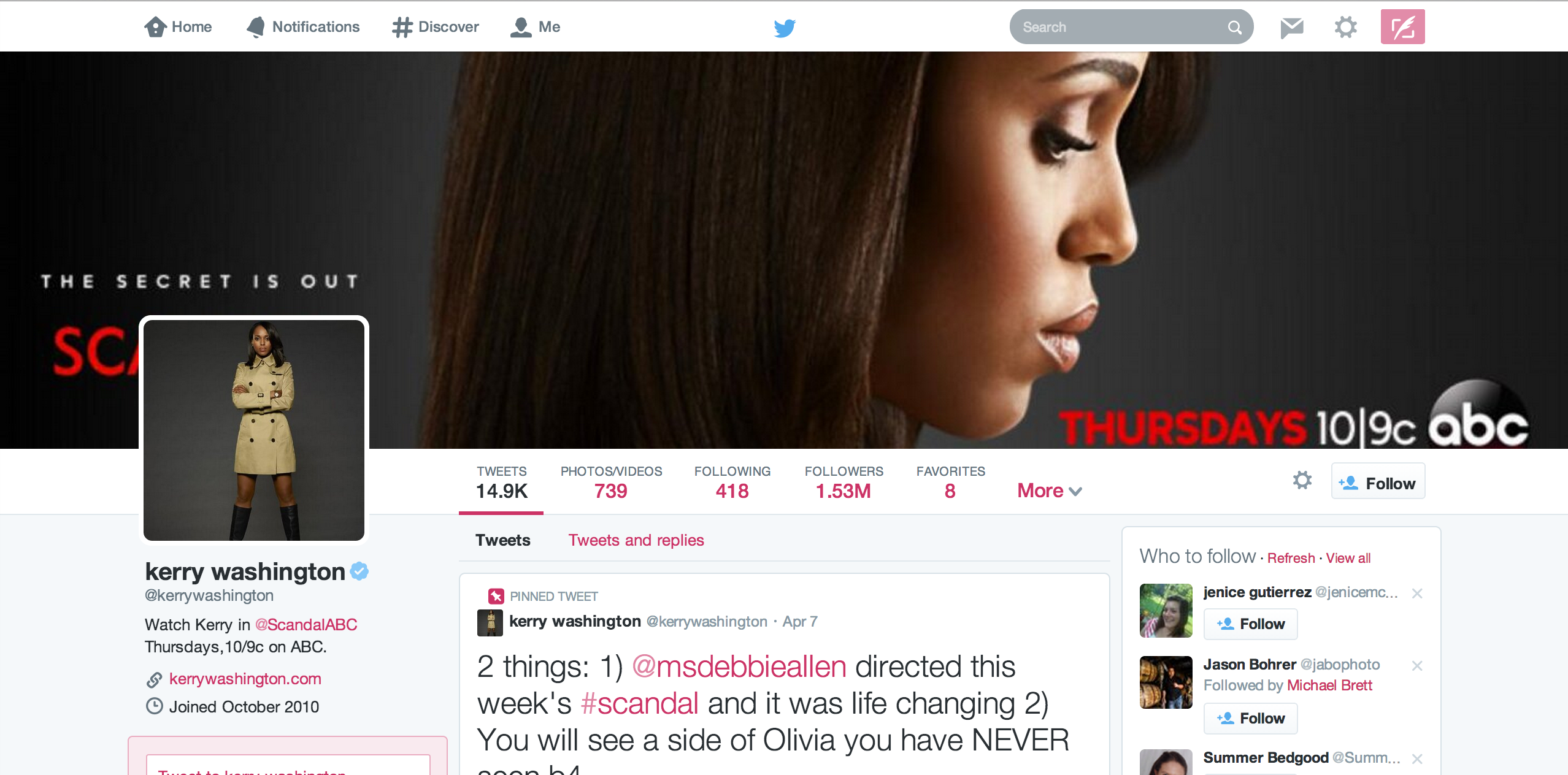
In case you haven’t heard, Twitter will be pushing out a redesign in the next few weeks and the changes are significant, yet familiar. Some accounts already have access to the new profile interface, presumably for promotional purposes. One such profile is that of Kerry Washington:
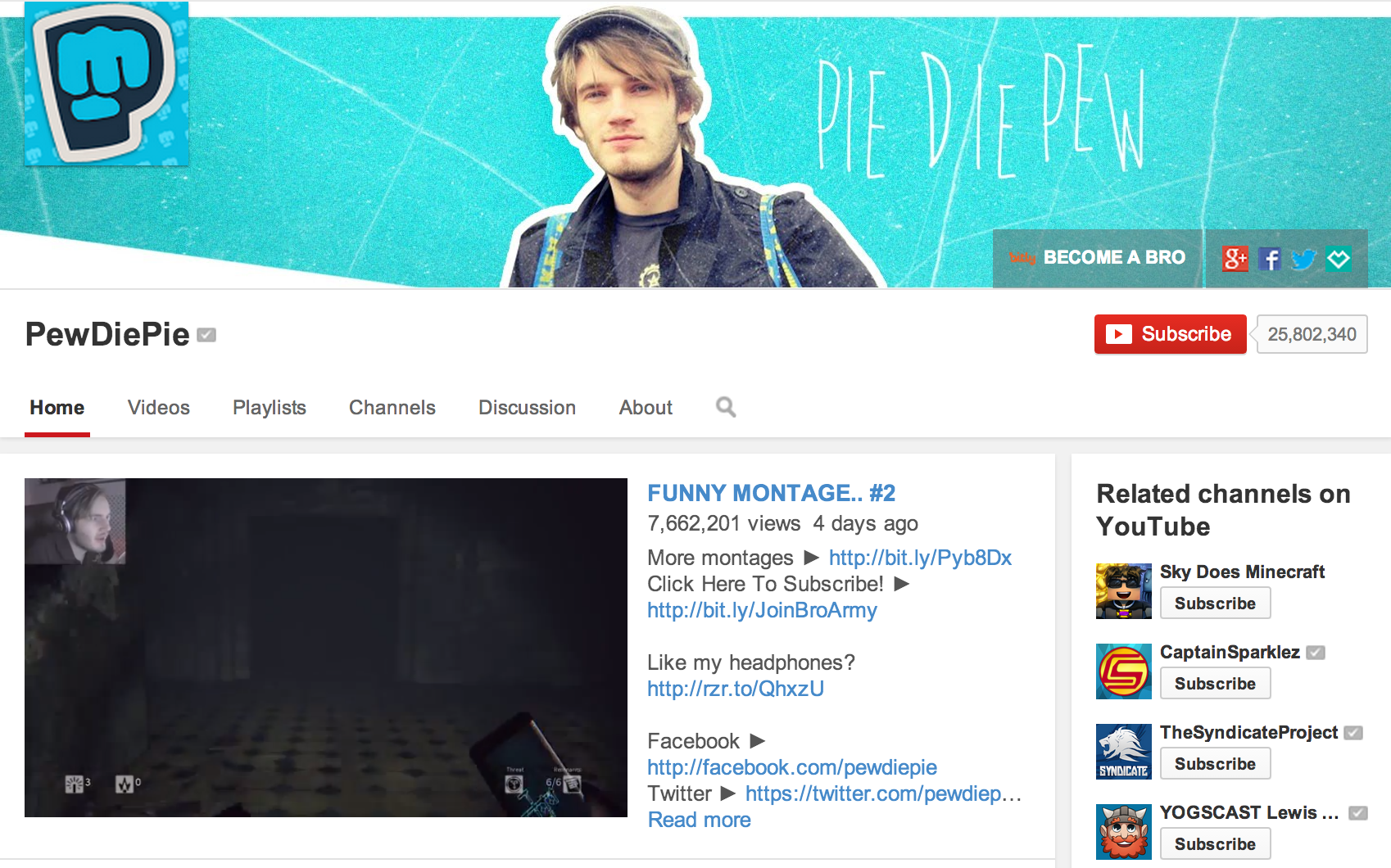
I don’t know about you, but at first glance I thought this was a Facebook profile. The horizontal cover image and prioritization of images in the feed almost make the new Twitter appear to be a Facebook Doppelgänger. But that might be the point, according to Gartner analyst Brian Blau: “People are intimidated by the open nature of Twitter. The redesign kind of looks like other networks, and that’s what people are already used to and comfortable with. This direction might reduce that level of intimidation.” And that “intimidation” is possibly what led YouTube to introduce profile header images, too:
Social media redesigns have seldom, if ever impacted my usage. But I use Twitter more than any other platform – both professionally and personally. If they are conforming to what’s familiar to most, what will that mean for the people most familiar with Twitter? What of the longtime, loyal patrons like myself? According to Blau, we don’t matter all that much: “It’s the future users who will drive the business forward. They’re the target for advertisers. They’re different from the digerati and the people who flock to these networks early on. It’s the mass market that has the buying power. That’s what Twitter’s really after.”
But remember Twitter, being a cover artist isn’t like being a real artist if you’re just copying the work of another. After all, doing your own thing was what got you to 200 million users in just eight years.
Source: Wired


